So here ya go! If you're interested, read on. :) If not, skip to the end for the final product! LOL!!! Thanks for coming by!
*****************************************
1) After I have decided which pictures I am going to scrap, I will hold them up to several pieces of patterned or solid papers to decide which one they look best against. This will be the paper I will mount my photos to, and then I work backwards through the layers from there.
These are pictures of me as a baby. Naturally, I first thought of something pink. Baby girl = pink, right?
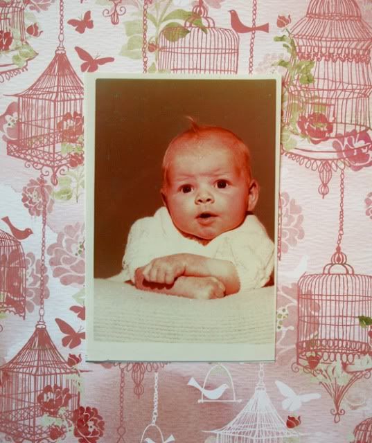
Because these are older photos, they have a pinkish-yellow tint to them. When I put them up to this paper, it seemed to magnify that tint, and that is not what I wanted to do.
I used my knowledge of the color wheel and decided to next try the complimentary color to pink (or red); GREEN, to tone down the pink in the pictures.
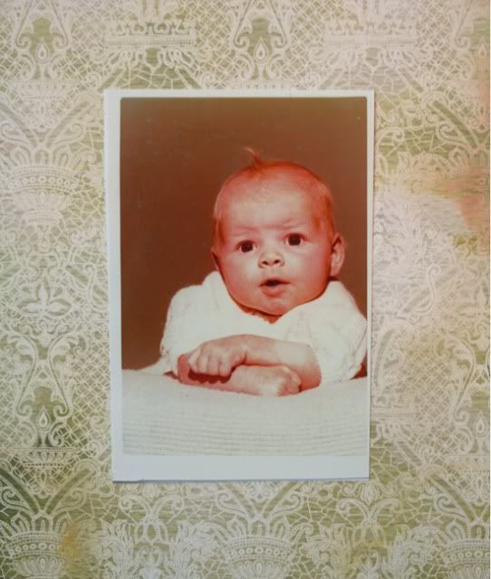
I liked this much better, but something was still "off". The personality of the paper felt too formal for a baby photo, so I tried another green patterned paper.
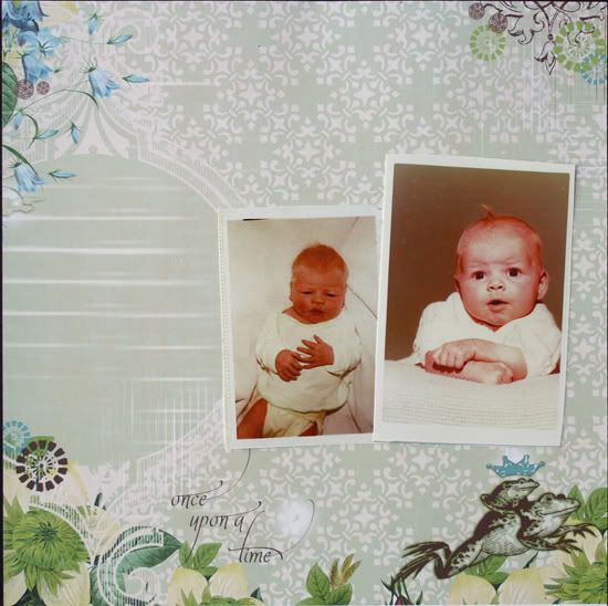
This was IT! I loved the soft pattern and the whimsy of the frog and caption "Once Upon a Time" printed on the paper.
I LOVED this piece of paper and I didn't want to cut it up to use it as a photo matte; so I made the decision to use this as my background and adhere my photos directly to it.
The circle shape printed on the paper helped me decide where to put my photos. I decided to adhere them to the right of it, thinking that later I could place my title and/or journaling in the circle.
Next, I needed to anchor my photos so they didn't look like they were floating in space. I chose a wide band of cream/white trim from the kit.
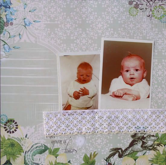
Good! I like that. Okay, next thing. I want this page to be soft, but this is a picture of a baby girl, so there definitely needs to be some pink in there.
I cut a strip of pink patterned paper and layered it on top of the trim. I really liked how that gave even more weight to my photo grouping and made it feel like it was grounded.
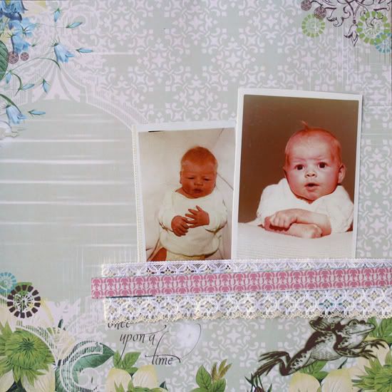
Next, I needed to add some whimsy . . . it was starting to feel a little too formal. So I added the buttons along the pink strip of paper. PERFECT!
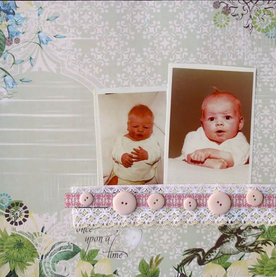
I liked where my design was going, but still felt like the photo grouping needed some more definition. I didn't want to put another layer under my photos so I decided to frame them with a circle of patterned paper. I chose the light woodgrain pattern, because it had a different feel to the background paper. It shows up because it has a slightly different personality, but didn't call away too much attention, still letting the photos be the focus. I chose the circle shape because it softens the square edges of the photos and mimics the other circle printed on the background paper.
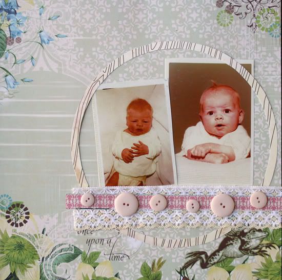
It still needed a touch of whimsy and MORE PINK! :) So I cut out some pink butterflies and scattered them here-and-there around my photo grouping for accents.
THIS FELT GOOD! This was my design. Now I could start glueing things down before hitting the title and other accents.
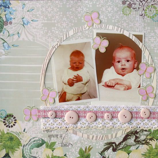
Before glueing everything down, I ran a border or brown stitching around the edge of the background paper to define it a bit. When I added the butterflies, I decided that they were an opportunity to add more dimension to my page, so I layered a second butterfly on top of the first ones, folding their wings up.
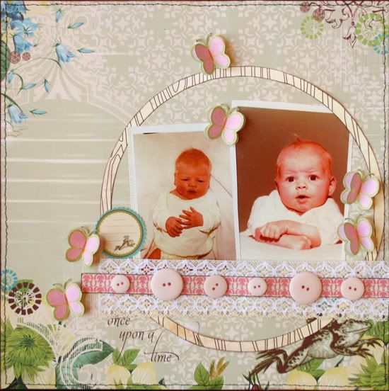
Initially I thought I would put my journaling and/or title in the circle off to the left of the photo grouping. I decided that all I needed for this page was a simple title and a date and age, there wasn't much more I needed to add. Therefore, I added a small journal spot to contain the info. and added my title along the edge of the circle.
I felt like my circle felt disconnected somehow from the rest of the page and added a flower rubon to the top right to transition the edge of the circle to the edge of the background paper. I also added a flower rubon to the bottom left of the grouping to transition the level of the butterflies to the printed flowers on the background paper.

From here I felt like my page was pretty much finished. I liked how it came together and I could have left it like this.
After staring at it for a minute, I decided to add a little sparkle to the wings of the butterflies with Stickles dots. THERE! Now, it's done.
It has softness, texture, dimension, a sense of history, and whimsy; just what I wanted for this baby girl page! :)
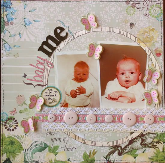
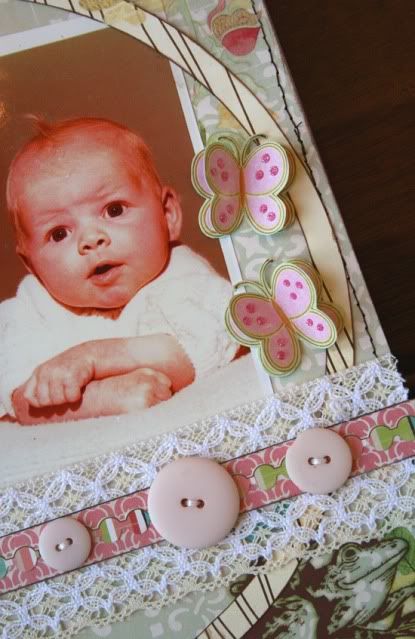
Thanks for coming by! :)
Jana


I absolutely LOVE that you did this Jana! I've always wanted to know the thought processes of my fave scrappers, and I definitely count you as one of my favorites! I love this, because it's like looking in to your mind! And of course I love the way you think! I found myself responding outloud with "huh", "oh my", because I totally see where your thought process was leading you! Thanks for the tremendous insight! I'm sure I'll read this again and again!
ReplyDeleteWOW!! That's interesting!! people ask me about my cards and I don't know ! LOL!! I will have to think about that!!! Your LO is awesome!!! Thanks for sharing your insite!!!
ReplyDeletePURE Genius!! Thank you for the wonderful insight into your creative mind... I'm always amazed by your design choices! I only wish I had half of your talent. Thanks for always sharing! ~ Gloria
ReplyDeletegreat tutorial
ReplyDeletethanks very much for sharing
Wonderful, please do this again - I've always loved your pages so seeing how you get from photos and paper to the finished article was a real insight - thank you! Katherine x
ReplyDeletethank you!
ReplyDeleteI really anjoyed to see how you create a scrapbook page!
this is an amazing LO!
I love that, it really helps me understand your process. You should do it more often!! It's a great layout by the way, love it!
ReplyDeleteooo THANK YOU! I agree, I have always wished I could be a bug on a wall while my fav. scrappers scrap! now, could you just do this for ALL of your pages!? :D that would be SUPER! he he
ReplyDeletehey a couple questions, a) would you mind sharing your inking/chalking secrets? maybe in an upcoming tutorial? I would love to know what you use and when.
also, you should do some "question and answer" stuff. I know a lot of people have questions they are dying to know about Jana Eubank:)
ok, sorry Have a great weekend girlie!
That was fun watching your creative process! Beautiful LO, too! :-)
ReplyDeleteI tried emailing you the paper info, but it bounced back as undeliverable.... so I'll just tell you here!
The paper you commented on is from the K & Company (Carolyn Gavin) paper pad. Thanks for the sweet comments, too, by the way!
Have a GREAT weekend, Jana! :-)
That was really helpful, Jana! Thank you...Sometimes I feel like I just sit and stare at my photos and paper too long and get little done. It helps to know how others figure out their layouts.
ReplyDeleteI love that you took us through your thought process! Maybe this could be a weekly thing?!!! I know I would love to see the progression of your pages! This baby LO is gorgeous!!!!
ReplyDeleteThanks for sharing your thought process - love seeing the progression. I love your work and enjoy visiting your blog.
ReplyDeleteWhat an interesting post this was!!! I really enjoyed walking thru the process "with you"! You make it sound so easy too ;)
ReplyDelete